Task 3: Type Exploration and Application
Week 9 - Week 14
29/05/2023 - 07/07/2023
Name: Joan Chiam Zi Woei
Student ID: 0350211
Advanced Typography
Task 3: Type Exploration and Application
Instructions:
Module Information Booklet
Process of Task 3: Type Exploration and Application
For the final task, we begin by coming out with different ideas for what we would work on as our final task. We were asked to have three ideas and compile it into a presentation slides.
Fig. 1 Presentation of my three ideas for the final task. (30/05/23)
After showing my slides, my third idea was approved as the first idea was overused and the second idea does not seem to relate much to the task. With the approval given I started doing research and experiment for my task.
Visual Reference
In game there's different kind of attack movement that helps create type of slash to create shapes and words. I've also noticed that different weapon also affect the slash lines and thickness of it.
 |
| Fig 2.1 Visual References |
 |
| Fig 2.2 Visual References |
 |
| Fig 2.3 Visual References |
 |
| Fig. 3.1 Initial "sketch" of the letter A (05/06/23) |
 |
| Fig. 3.2 Initial "sketch" of the first 3 letters from the alphabets(05/06/23) |
I didn't like how the B turned out so I tried to reference it from the letter C.
 |
| Fig. 3.3 Redesigned version of letter B (05/06/23) |
I also tried using pen for this. In compare to scissors, pen is easier to control when carving on the cardboard but it require more force and strength to create carvings on the cardboard while it is easier to cut through the cardboard with a scissors.
 |
| Fig. 3.4 "Sketch" of the first 3 letters with pen (05/06/23) |
After showing it to the lecture, I was advice to try out some other methods instead of just scratching out cardboard with different tools to make a font. So with that in mind, I decided to create different slashes on a harder surface and with better tool such as knife and chainsaw.
 |
| Fig 4.1 Creating knife cut on wood board (09/06/23) |
 |
| Fig 4.2 Traced stroke with pen tool (10/06/23) |
After tracing out the stroke, I refined it a bit to make it thicker so that I can turn it into letters.
 |
| Fig 4.3 Refined traced stroke with pen tool (10/06/23) |
I've came out with some sketches of different letters by using the strokes.
 |
| Fig 4.4 Letters created by the stroke (10/06/23) |
After receiving my feedback, I was advised to implement the strokes into alphabets instead of turning it into alphabets so I had to scratch out my idea and think of a new one. The idea that I'm using is workable but is really hard to keep the consistency going within the letters and it was also hard to come out with the designs with consistency and making it look good in mind so it was honestly a helpful advice given to me.
I came out with a new design after researching for more ideas. I took Valorant's in game font as an inspiration to create a bold and angular letterforms.
 |
| Fig 5.1 Font used by Valorant for more visual references |
 |
| Fig 5.2 Process of creating letter (18/06/23) |
I added in the stroke from previously and added it into the letter to give it the characteristic of scars and sharpness from a knife to make my font more unique.
 |
| Fig 5.3 Process of creating font (18/06/23) |
 |
| Fig 5.4 Final design of the typefaces (19/06/23) |
 |
| Fig 5.5 The wireframe view of the letters (19/06/23) |
Generating Font
After that I imported all of it into FontForge. I was not familiar with it so I explored around and watched some video tutorials to figure it out.
 |
| Fig 6.1 Process in FontForge (30/06/2023) |
After importing all the characters into FontForge, I also did some adjustment to make sure there's no random letter hovering or out of place. With all those done, I worked on the kerning and after that I generated the typefaces which can be seen by clicking this link.
 |
| Fig 6.2 All of the characters (02/07/2023) |
With the typeface complete, I moved onto creating a poster to display the font as well as some applications. My font is meant to be used in Valorant so I searched up for some posters and applied my font onto it.
 |
| Fig 7.1 Applying typefaces onto poster (03/07/2023) |
I also create some poster on my own on Adobe Photoshop.
 |
| Fig 7.2 Process of creating a poster (03/07/2023) |
 |
| Fig 7.3 Final display poster (03/07/2023) |
 | |
|
 |
| Fig 7.5 Final display poster (03/07/2023) |
 |
| Fig 7.6 Final display poster (03/07/2023) |
I've also applied it onto in game screen to see what it would look like.
 | |||||||
Fig 7.7 Final in game display (04/07/2023)
|


 |
| Fig 7.11 Final font display, JPEG, (06/07/2023) |
Fig 8.1 Final Font Display compilation, PDF, Week 14 (07/07/2023)
Fig 8.2 Final Font Application compilation, PDF, Week 14 (07/07/2023)
Feedback
Week 9
General Feedback :
- For ideation for final project; All the ideas were not approve due to being too general/ not an issue necessary to be fix.
Specific Feedback :
- The first idea had been done a lot from previous students so it is rejected. The second idea is an issue that foes not affect others much therefore not approve. Idea 3 was approved after futhur discussion with sir after class.
Week 10
General Feedback:
- Do more experiment on the cut on different surfaces, tools and technique.
Specific Feedbacks:
- Study the stroke, extract what I see instead of try to just mimic typefaces that have cuts on it.
Week 11
General Feedback:
- Try to implement the stroke onto the typefaces instead of using it to make into letters.
Specific Feedback:
- It is to keep the consistency going within the letters with the method that I'm using so it would be better to design my font in another way.
Week 12
General Feedback:
- My typefaces look consistent but there are still some adjustment/ refinement to be made.
Specific Feedback:
- The typefaces still have some noticeable mistake so need to do some necessary adjustment.
Week 13
No feedback due to no class
Week 14
No feedback due to absence
Reflections
Experience
I had experience making font from Typography class but it still gave me a lot of challenges when this time not only all 26 letters in both upper and lowercase I also had to come out with numbers and punctuations. It takes time for me to slowly get a grip on my design as well as the process of turning them into font and applying it. Even though I struggled, I still like the feeling of fulfillment when typing with the typefaces that I've created. Overall, it was a long and slow journey creating my typefaces but I enjoyed it a lot.
Observations
Creating typefaces is an intricate process that requires observation and attention to detail. Throughout the journey of crafting a typeface, I discovered that making subtle adjustments to letterforms, such as modifying stroke thickness or changing the spacing between letters, based on how they appeared to the eye helped me achieve more balanced and visually consistent results even though it might not be the same size or distance as the others but it will look so much better doing so.
Findings
While creating a typeface, I made several intriguing findings that helped with my understanding in typography. These findings helped with my design process and somewhat influenced the final outcome of the typeface. I discovered that form and function are intricately intertwined in typeface design. Balancing aesthetic appeal with the functional requirements of legibility, readability, and clarity.
Further Reading
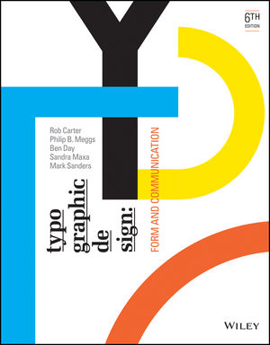 |
| Fig 9.1 Typographic design: Form and communication |
Week 10
Optical relationships within a font
- Mechanical and mathematical letterform construction can sometimes lead to spatial issues, as the diverse forms within an alphabet may appear optically incorrect. However, by applying optical adjustments, visual harmony can be achieved within a font.
- Making adjustments that are very subtle and are often imperceptible to the reader. However, their overall effect is a more ordered and harmonious appearance.
Unity of design in the type font
- Typography encompasses a vast array of forms within a font, including 26 capital letters, 26 lowercase letters, 10 numerals, punctuation marks, and additional graphic elements. These elements must be skillfully integrated into a cohesive system that allows for their successful combination into countless words.
- Letterforms share similar parts. Repeated curves, verticals, horizontals, and serifs are combined to bring variety and unity to typographic designs using this typeface.
Typographic Measurement
- Our measurement system for typography was originally developed for the handset metal type invented by Johann Gutenberg around 1450.
- There were no standards in typographic measurements up until the French type designer and founder Pierre Simon Fournier le Jeune introduced the point system of measurement in 1737.
 |
| Fig 9.2 Point system of measurement |
- The standard units of measurement are Point and Pica.
Week 13
Type Family
- A type family consists of a group of related typefaces, unified by a set of similar design characteristics. Each face in the family is individual, and each has been created by changing visual aspects of the parent font.
- Weight changes and proportions plays an important role as they are the methods for adding typefaces to a type family.
Basic Principles Of Legibility
- The main goal of a letterform is to effectively convey meaning. To achieve this, letterforms must be designed with clarity and distinction within the alphabet. The contrast between characters allows readers to easily understand written information without confusion.
- The most legible typefaces possess three essential qualities: contrast, simplicity, and proportion. These timeless examples prioritize these qualities to ensure optimal legibility.


Comments
Post a Comment