Task 3
Week 7 to Week 11 :
10/ 10/ 2022- 8/ 11/ 2022
Name: Joan Chiam Zi Woei
Student ID: 0350211
Typography
Task 3: Type Design and Communication
Lectures
See lecture notes in Task 1: Exercises and Task 2: Typographic Exploration and Communication
<iframe src="https://drive.google.com/file/d/1jh8Lmyqqn_m8yTkUOSnXH83JzO3pWizc/preview" width="640" height="480" allow="autoplay"></iframe>
Task
Typography Task 3A Typeface Construction
For Task 3A we need to design a set of letters as a font. The process work is from idea sketches to digitization. For the sketch, we are allowed to sketch our designs either in sans serif or serif and uppercase or lowercase. We are instructed to use one of the typefaces from the 10 typefaces given as references. Deconstruction of a typeface is also crucial to study the anatomical parts of the typeface and to observe the small details for us to be able to pay attention to the intricate details required when designing a font.
The letters that are to be designed are a e t k g r l y m p n ! # , .
Research For Type Design
When designing a font, some factors that need to be put into consideration are the ascender height, capital height, median line, baseline, and descender line. Guidelines, contrast, angle of stress, and terminals are also essential elements when designing a font.
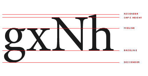 |
| Fig 1.1 Vertical Measures by Alec Julien |
When delving into the minutiae of font design, it will soon become obvious that there is a slew of important vertical metrics that aren’t much talked about.
Identify and Deconstruct
After conducting some research, I started searching through the ten provided typefaces to find a font that I would like to work with. I ultimately chose Futura std as the font that I want to study and work on.
 |
| Fig 2.1 Deconstructed 'a' Futura STD Medium Condensed Week 9 (28/10/2022) |
 |
| Fig 2.2 Deconstructed 'e' Futura STD Medium Condensed Week 9 (28/10/2022) |
 |
| Fig 2.3 Deconstructed 'g' Futura STD Medium Condensed Week 9 (28/10/2022) |
The letters I chose to deconstruct are going to have similar to the fonts that I am going to work on.
Sketch
After doing research on Type Design, I proceed on with the sketches. I drew my sketch on a drawing application as it makes it easier for me as I could use guidelines by using the app. The sketches that I came out with are taken inspiration from Futura std family font. The inspiration I took are mostly from Futura Std medium condensed for the first sketch and Futura Std Light for the second sketch. I wanted to make the font look unique and have its own style while not losing the features of the fonts provided from the 10typefaces so these are what I could come out with.
 |
| Fig 3.1 Sketch Idea#1 Week 8 (21/10/2022) |
 |
| Fig 3.2 Sketch Idea#2 Week 8 (21/10/2022) |
Digitalization of Font Process
I used Adobe Illustrator to digitize all the 15 characters, including 11 letters and 4 special characters. This is what I came out with.
 |
| Fig 4.1 First attempt for digitalization Week 9 (29/10/22) |
 |
| Fig 4.2 Second attempt oatchanging Week 9 (29/10/22) |
I did some attempts on changing the font to only a single colour. After getting further feedback from Mr Vinod, I decided to go with the first design which is the all black font.
 |
| Fig 4.3 Font before adjustment Week 10 (4/11/22) |
 |
| Fig 4.4 Font after adjustment Week 10 (4/11/22) |
With regard to feedback received in Week 10, I made further refinements and adjustments to my typeface. I changed the stroke of the llettersm, p and n to maintain the consistency of the typefaces.
 |
| Fig 4.5 Adjustment of 'g' Week 10 (5/11/22) |
I was checking on the typefaces to ensure that all of the letters are consistent. Then I noticed that the first attempt of my letter g looked off since the thickness of the stroke is not the same as y. So I switched the thickness of the strokes as shown in the image above so that it will have the same thickness as y.
 |
| Fig 4.6 Final type design in JPEG format. Week 10 (6/11/2022) |
Fig 4.7 Final type design in PDF format. Week 10 (6/11/2022)
 |
| Fig 4.8 Type design in wireframe view, showing the construction of letterforms. |
 |
| Fig 4.9 Measurements from Baseline |
After receiving feedback in Week 11, I adjusted and finalized the typeface. I also noted down the measurements of the ascender line, cap line, median line, baseline and descender line.
Measurements from Baseline
Ascender : 718 pt
Cap height : 662 pt
Median : 503 pt
Baseline: 0 pt
Descender : -177 pt
Developing of Final Font in Fontlab
Now that the typeface was finalized, it is time to generate it into FontLab. I decided to name my font family Sakamoto. It was named after an artist that I admire and also combining the fact that the original design for my font was to make it look like an origami which did not make it to the final design. In conclusion, this typeface is called Sakamoto Regular.
 |
| Fig 5.1 Typeface in FontLab in the metrics table. Week 11 (7/11/2022) |
 | ||
|
Here is the link to the final .ttf file. (7/11/2022)
 |
| Fig 5.3 Final poster in JPEG form. (7/11/2022) |
Fig 5.4 Final poster in PDF form. (7/11/2022)
Feedback
Week 9
General feedback - The first design looks better than the other so I can try to work with that.
Specific feedback - My alphabets are good and interesting, the only adjustment I'll have to make is for the alphabet 'K'. After that I can proceed with digitalizing.
Week 10
General feedback - Don't use two colours for the font, use either just black or white. The # need a bit of adjustment.
Specific feedback - Use only one colour for the font, either black or white. Comma looks interesting. The # is off it should be the horizontal line that's slanted instead of vertical.
Week 11
General feedback - Make a decision on which direction the font is going for to maintain consistency.
Specific feedback - The strokes for m, p and n should be heading towards the same direction as the other letters.
Reflection
Experience
This task gave me an opportunity to make my first ever own font which was pretty interesting and fun to do. It was cool to see how my designed font slowly go from sketches to an actual usable font. The satisfaction and pride was indescribable when I first type down my font. I'm very happy that this project helped me improve my observation skill as I'm constantly checking for error and consistency for my font.
Observation
I observed that it is important to check for every details while making a typeface. Learning how to maintain a good balance for the fonts is a process that everyone had to go through while designing a font. I also noticed that different designer chooses a different direction for their type design as I look through my classmates work, we all uses the same typefaces provided but everyone's approach for their design are different. Going through designers and my classmates' work was able to help me improve on my creativity and made me understand more variation of typeface design.
Findings
I found that I need to look at the details of my work more closely because I often made mistakes on forgetting to make changes on the letters that have similar features to maintain consistency. During the process of making type font, I also notice that there are a lot of details on the shapes and sizes should be paid more attention on in case of messing up the similarity of the letters.
Further Reading
 |
| Fig 6 Book Cover for Digital Fonts |
This book provided tutorials on how to create fonts and it also features interviews with multiple professional font designers, The book is a comprehensive and practical guide that showed explorations in every aspect of the font creation process. It included everything from sketching initial letterforms to mastering the font creation software such as Fontlab and Fontographer. Other than that, this book is also the first of its kind to address the important issue of how designers can best market and sell their fonts, and includes advice on copywriting and working with foundries, as well as how designers can set up their own foundries. Throughout the book, screen grabs and illustrated diagrams are shown clearly and it clarified each part of every process and to help readers with all the essential information they need. Interviews with professional font designers and foundry owners provide an insight into their working processes, while accompanying portfolios demonstrate a wide range of inspirational font styles.


Comments
Post a Comment