Task 2
Week 6 to Week 8 :
4/ 10/ 2022- 18/ 10/ 2022
Name: Joan Chiam Zi Woei
Student ID: 0350211
Typography
Task 2: Typographic Exploration and Communication
Lectures
Week 6:
Typography In Different Medium
Print Type VS Screen Type
Print Type VS Screen Type
- Type for print: Garamond, Baskerville, Caslon are most commonly used for print because of their readability at small sizes and versatile.
- Type for screen: Type is meant to use on web are optimized and modified to enhance readability and performance onscreen.
- Taller x-height, wider letterform, more open counters, heavier thin strokes and serifs, reduced stroke contrast, modified curves and angles for some designs.
- Georgia, Verdana.
- More open spacing to enhance readability and improve character recognition in a non-print environment.
Instructions
<iframe src="https://drive.google.com/file/d/1jh8Lmyqqn_m8yTkUOSnXH83JzO3pWizc/preview" width="640" height="480" allow="autoplay"></iframe>
Exercise
Task 2: Text Formatting & Expression
For task 2, we need to express a 2- page editorial spread typographically which is 200mm x 200mm per page. We get to choose 1 editorial text out of the options provided. We then use Adobe InDesign to typographically compose and express the text, and Adobe Illustrator for the headline expression is optional.
1. Visual Research
Before starting on the sketches for the layouts, I did some research to get an idea of how to design the type expression for the Follow The Code.
 |
| Fig 1.1 Follow The Code layout inspiration |
Coding doesn't usually involve complete freedom of expression that's why I wanted to make the design look simple and minimalistic. I wanted to involve lines that look like elements of HUD which is a futuristic effect often seen in software programming. I also wanted to add some symbols that are often used in programming to make the text expression more related to programming.
2. Idea Exploration with Sketches
 |
| Fig 2.1 Sketches for layout, Week 6 (7 /10 /22) |
I came out with 4 layout ideas. For my first design, I gotten the feedbacks from my classmates and most of the feedbacks I've gotten was to explore more and to be mindful about my text placement and font size. On the second design, I added in more elements but it did not improve at all so I moved on to the third design which changes the font placement and I removed the boxes surrounding the text to make it have more breathing space. I also used a curly braces which is a symbol often used in coding to replace the boxes. On the fourth design I decided to blend in both
 |
| Fig 2.2 Final Sketch Design, Week 6 (14 /10 /22) |
I decided to take the ideas from the first and fourth design then combine the elements into my final design. I took the lines on the first design and combine it with the black and white page with curly braces. I also decided to use the placement of the text heading from the fourth design so that the gap would not be too big which made it look unpleasant.
3. Layout Process
 |
| Fig 3.0 Left Layout Week 6 (15 /10 /22) |
 |
| Fig 3.0 Right Layout Week 6 (15 /10 /22) |
I first started out by adding the graphical elements for my layouts that symbolizing coding elements. I did not place in the texts yet so that I can estimated where everything can be place properly. After that I added in the text and fixed the dragging, kerning and cross alignment.
Week 6 Layouts
 |
| Fig 4.0 Layout #1 |
Fonts: Futura Std, Extra Bold Condensed and Univers LT Std, 45 Light
Point size: 9pt
Leading: 10.8pt
Paragraph Spacing: 1.5mm
Line Length: 94
 |
| Fig 4.2 Layout #2 |
Fonts: Futura Std, Extra Bold Condensed and Univers LT Std, 45 Light
Point size: 9pt
Leading: 10.8pt
Paragraph Spacing: 1.5mm
Line Length: 94
As I was digitalizing my sketches, I tried two different attempts. One with black and white background and one with only white background. In the end I decided to go with the second design.
Final Outcome Of Text Formatting
 |
| Fig 5.0 Final Layout JPEG, Week 8 (18/10/2022) |
 |
| Fig 5.1 Final Layout with guides and grids JPEG, Week 8 (18/10/2022) |
Fig 5.2 Final Layout PDF, Week 8 (18/10/2022)
Fig 5.3 Final Layout With Guides and Grids, Week 8 (18/10/2022)
Week 6:
Peer Feedback:
General Feedbacks:
- Explore more for better ideas.
- Make sure to adjust the fonts so that everything would fit properly in place.
Specific Feedbacks:
- Change the layout and make it look more balance.
- The gap of fonts should be closer.
- The overall layout is fine, graphical elements are well illustrated but I have to be mindful about the placement.
Reflection
Experience:
I found this task to be quite easy as I was more familiar in Adobe Illustrator and tools to create the graphical elements. I was able to improve my work after getting more than one feedbacks from my classmates.
Observation:
I've observed different references and used it as my inspiration when creating a layout to make it look simple and minimalist. I tried to make it pleasing to look at.
Findings:
I noticed that I kept making common mistakes such as forgetting about leaving out widow and orphan. I also miss out on kerning which made the overall text look messy. This is due to me being too focused on design instead of focusing on the text.
Further Reading
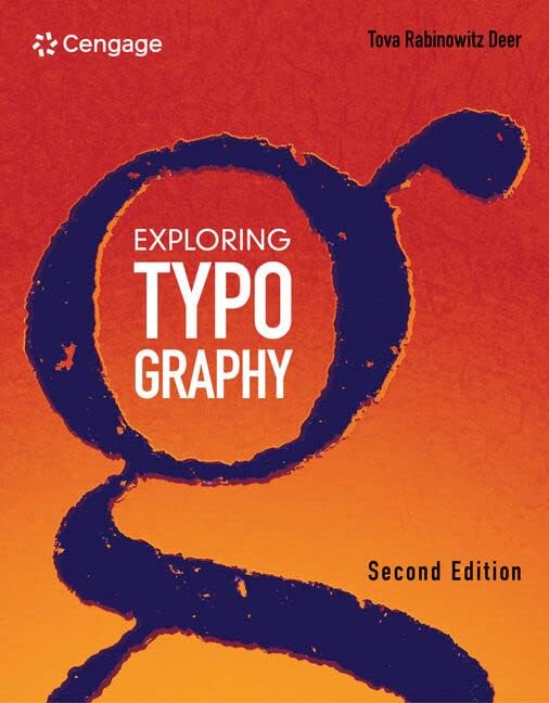 |
| Fig 6.0 Exploring Typography |
In Chapter 8, it talked about kerning is required because some letter pairs will still look odd even with optimum sidebearing values. Kerning's objective is to make letter pairs appear natural rather than making unnecessary letterspaces. When we are using a font editing program, we are trying to trick the computer into thinking a specific pair of letters has alternate sidebearing values therefore we can use it to make the overall text to look smooth and pleasant.
It also talked about spacing as it is an important factor. A good quality spacing from a font require lots of time because it can only be done by eye. To create a good layout, the legibility of the fonts are dependent on its letterspacing. It is important to be mindful of the rhythm of the negative spaces. The proportions of letterspaces and counters ought to produce a constant flow of visual rhythm.


Comments
Post a Comment