Task 1: Exercise
Week 1 to Week 5 :
2/ 9/ 2022- 30/ 9/ 2022
Name: Joan Chiam Zi Woei
Student ID: 0350211
Typography
Task 1: Exercise
Lectures
Week 1:
In the first week, we were introduced to the class and we learned about what the subject is about. We were shown links and references that are useful for our future work. For our task 1, we suggested some words and voted among the words. The final words were Fire, Shatter, Tall, Ring, Freak, and Whisper. We will need to choose 4 words out of the 6 to create the type of expressions. The words that I chose were Fire, Shatter, Tall, and Freak.
Lecture 1: Typography Development/ Timeline
1. Early letterform development: Phoenician to Roman
Fig 1.1 Evolution of Phoenician to Roman Letters (2/9/2022)
- The forms of the uppercase letterforms evolved from the writing method of scratching into wet clay with a sharpened stick or carving into stone with a chisel.
- The uppercase forms were made from a combination of straight lines and circles.

Fig 1.2 Early letterform development: Phoenician to Roman (2/9/2022)

Fig. 1.3: Boustrophedon, the direction of the writing from the
Greeks (2/9/2022)
- Greeks developed a style go writing called 'boustrophedon' which is changing the direction of writing from right to left to alternating right to left and left to right.
2. Hand script from 3rd -10th-century C.E.

Fig 2.1 4th /5th century: Square Capitals (2/9/2022)

Fig 2.2 Late 3rd to mid-4th century: Rustic capitals
Rustic capitals: It is a compressed version of the square capitals. It is
faster and easier to write but hard to read.

Fig 2.3 4th century: Roman cursive
Roman Cursive: Both the square and rustic capitals were reserved for
documentary purposes. It is simple and therefore faster to write.

Fig 2.4 4th – 5th century: Uncials
Uncials: It incorporated some of the features of the Roman cursive
hand, especially the shape of A, D, E, H, M, U, and Q. The broad forms
of uncials are more readable at small sizes than rustic
capitals.

Fig 2.5 C. 500: Half-uncials
Half-uncials: Formalization of the cursive hand, half-uncials is the
formal beginning of lowercase letterforms.

Caloline Miniscule: Charlemagne, the first unifier of Europe since
the Romans, issued an edict in 789 to standardize all
ecclesiastical texts. He entrusted this task to Alcuin of York,
Abbot of St Martin of Tours. The monks rewrote the texts using
both majuscules (uppercase), miniscule, capitalization, and
punctuation which set the standard for calligraphy for a century.

|
| Fig 2.7 c. 1300: Blackletter (Textura) |
Blackletter: With the dissolution of Charlemagne’s empire came
regional variations upon Alcuin’s script. In northern Europe, a
condensed strongly vertical letterform known as Blackletter or
textura gained popularity. In the south, a rounder more open hand
gained popularity, called the ‘rotunda’. The humanistic script in
Italy is based on Alcuin’s miniscule.

|
| Fig 2.8 c. 1455: 42 line bible, Johann Gutenberg, Mainz. |
Blackletter to Gutenberg’s type: Gutenberg’s skills included
engineering, metalsmithing, and chemistry. He marshaled them all
to build pages that accurately mimicked the work of the scribe’s
hand – Blackletter of northern Europe. His type mold required a
different brass matrix, or negative impression, for each
letterform.
3. Text Type Classification

|
| Fig 3.1 Hand Script from 3rd - 10th century C.E |
The current state of technology, societal demands, and aesthetic
fads have all influenced the development of typeforms. The main form
of text type is covered by Alexander Lawson as shown in Figure
3.1.
Week 2:
This week, we were instructed to start digitalizing our type expressions on adobe illustrator based on the typefaces that were chosen. Mr. Vinod gave us feedback on our sketches so that we can proceed with digitalizing our type expressions. He also showed us some of the designs that he came out with and teaches us the technique of how to do them.
1. Types of Letterform
- Baseline: Imaginary line at the visual base of the letterforms.
- Median: Imaginary line defending the x-height of letterforms.
- X-height: Height in any typeface of the lowercase 'x'.
- Bowl: Rounded form that describes a counter. May be either open or closed.
- Cross-bar: Horizontal stroke in a letterform that joins two stems together.
- Ear: The stroke extending out from the main stem or body of the letterform.
- Apex/Vertex: The point created by joining two diagonal stems.
- Arm: Short strokes off the stem of the letterform.
- Ascender: The portion of the stem of a lowercase letterform that projects the above median.
- Barb: The half-serif finish on some curved stroke.
- Bracket: The transition between the serif and the stem.
- Cross stroke: The horizontal stroke in a letter form that joins two stems together.
- Crotch: The interior space where two strokes meet.
- Descender: The portion of the stem of a lowercase letterform that projects below the baseline
- Em/en: Referring to the uppercase M, and em is now the distance equal to the size of the typeface. An en is half the size of an em.
- Finial: The rounded non-serif terminal to a stroke.
- Ligature: The character formed by the combination of two or more letterforms.
- Spine: The curved stem of the S.
- Stress: Orientation of the letterform, indicated by the thin stroke in round letterforms.
- Swash: Flourish that extends the stroke of the letterform.
- Link: The stroke that connects the bowl and the loop of the lowercase 'g'.
|
| Fig 1.1 The anatomy of the letterform, https://osmanassem.com/typography-the-anatomy-of-a-letter/ |
2. Fonts

|
| Fig 1.1 Uppercase and Lowercase |
- Small capitals: Uppercase letterforms are drawn to the x-height of the typeface.
- Uppercase numerals: They are the same height as the uppercase letters and all set to the same kerning width.
- Lowercase numerals: They are set to x-height with the ascenders and the descenders.
- Miscellaneous characters: They can change from typeface to typeface.
- Ornaments: They are used as flourishes in invitations or certificates. often provided as a font in a larger typeface family.
3. Describe Typefaces

|
| Fig 1.2 Describing Typefaces |

|
| Fig 1.3 10 Typefaces |
Week 3
Basics In Typography
1. Typography: Text / Tracking: Kerning and Letter spacing
Kerning: Automatic adjustment of spacing between letters
Tracking: Addition and removal of space in a word or sentences
Letterspacing: The addition of space between letters, it's mostly done in
headlines

|
| Fig 1.1 Comparison of Kerning and Without Kerning |

|
| Fig 1.2 Tracking on Words |
2. Text formatting
Flush left: Each line starts at the same point but ends wherever the last word
on the line ends.

|
| Fig 2.1 Flush Left, Ragged Right |
Centered: Symmetry on the text, assigning equal value and weight to both ends
of any lines.

|
| Fig 2.2 Centered, Ragged Left and Right |
Flush right: Place emphasis on the end of the line as opposed to its start

|
| Fig 2.3 Flush Right, Ragged Left |
Justified: Format imposes a symmetrical shape on the text.

|
| Fig 2.4 Justified |
3. Texture of Text

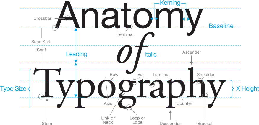
|
| Fig 3.0 Anatomy of Typeface |

|
| Fig 3.1 Type Size, Leading, and Line Length |

|
| Fig 3.2 Different typefaces in different gray values |
4. Leading and Line Length

|
| Fig. 4.0 Leading and Line Length |
5. Type Specimen Book
A type specimen book shows samples of typefaces in various different sizes. It
provides an accurate reference for type, type size, type leading, type line
length, etc.

|
| Fig 5.0 Sample Type Specimen Sheet |
Week 4:
This week, we received feedback from our animations of the type expression.
Mr. Vinod's feedback for my work was to make it look smoother and the rest are
all good. After that we watched 4 recorded videos elaborating on text
formatting on InDesign to guide us on how to do the next task which is on type
formatting.
Basics In Typography Part 2
Indicating paragraph

|
| Figure 1.1 Line space vs Leading |
Pilcrow ¶: It is used to indicate paragraph space

|
| Fig 1.2 Example of Standard Indentation |
Standard Indentation: Indent is the same size as the line spacing or the same
as the point size of the text.

|
| Fig 1.3 Widow and Orphan |
- Widow: Short line of the type left alone at the end of a column of a text
- Orphans: Short line of the type left alone at the start of a new column
Week 5:
Understanding Basic Aspects Of Typography
Understanding letterforms
The uppercase letter may appear as symmetrical but it is actually not
symmetrical in a close examination. The stroke on both the left and right
have unequal weight.
Maintaining X-height
 |
| Fig 1.1 Maintaining X-height |
 |
| Fig 1.2 Counterform |
Instructions
<iframe
src="https://drive.google.com/file/d/1jh8Lmyqqn_m8yTkUOSnXH83JzO3pWizc/preview"
width="640" height="480" allow="autoplay"></iframe>
Task 1: Exercise: Type Expression
In this task, we need to create type expressions from a selection of words.
The words were Fire, Shatter, Tall, Ring, Freak, and Whisper. We need to
choose 4 words out of the 6 to create the type of expressions. The words that
I chose were Fire, Shatter, Tall, and Freak.
Sketches
Tall

Fig 1.1 Type expression sketches, Tall (Week 1, 4 /9 /22)
Fire

Fig 1.2 Type expression sketches, Fire (Week 1, 4 /9 /22)
For the word fire, I had a lot of ideas for it. The first one is the word
having a burnt effect where it's like a paper being burned. For the second
one, it is the word fire shaped into a fire shape and for the third, it is the
alphabet "i" looking like a match.

Fig 1.3 Type expression sketches, Shatter (Week 1, 4 /9 /22)
For shatter, the only ideas I had are the word broke into pieces so for my
sketches it was all ways of the word falling/ breaking apart in different
ways.
Freak

Fig 1.4 Type expression sketches, Freak (Week 1, 4 /9 /22)
Digital Sketches
These are the digital sketches I came out with. Mr. Vinod gave me
feedback on it. He said I will have to redo the word freak and fire shown
in figure 1.5 since it was distorted. But he said the word shatter and
tall are good to go and I can proceed with my work after some
changes.

|
| Fig 1.5 Digital Sketches (Week 2, 7/9 /022) |

|
| Fig 1.6 Improvised Digital Sketches (Week 2, 7 /9 /22) |
Tall
For the word tall, I used the font Univers LT Std provided by the
lecturer.

|
| Figure 2.1 Tall Digitization (Week 3, 17 /9 /22) |

|
| Figure 2.2 Tall Digitization (Week 3, 17 /9 /22) |

|
| Figure 2.3 Tall Digitization (Week 3, 17 /9 /22) |
Freak
For the word freak, I used the font Futura Std - Book. I rearranged the
placement of the alphabet to make it look less neat and less proper to
create an effect to express the word not fitting in.
I used the brush tool in AI to draw on the alphabet to make it look like it's being sketched out by a pen/ sharp object.
This is what it looks like after being drawn by the brush.

|
| Figure 2.4 Freak Digitization (Week 3, 17 /9 /22) |
I used the brush tool in AI to draw on the alphabet to make it look like it's being sketched out by a pen/ sharp object.

|
| Figure 2.5 Freak Digitization (Week 3, 17 /9 /22) |
This is what it looks like after being drawn by the brush.
 | |
|
Fire
The font I used was Gill Sans Std- Extra Bold for the word fire. For this word, I wanted to create a paper burned-out effect. Therefore, I used white color with a black outline to make the word look like plain white paper. After that, I add in all the black burned-out effects by using the pen tool to draw out some holes on the top of the alphabet. I also use different degrees of gaussian blur effect to make the smoke effect.
 | |
|
Shatter
For the word shatter, the font I used was Universa LT Std. I first create outlines for the words then use a pen tool to draw some lines across the alphabet. After that, I use pathfinder to divide the lines and alphabet.
 |
| Figure 2.8 Shatter Digitization (Week 3, 17 /9 /22) |
After the lines have divided the parts of the alphabet, I pull them out to create a shattered effect.
 |
| Figure 2.9 Shatter Digitization (Week 3, 17 /9 /22) |
Final Type Expression
 |
| Fig 1.1 Final version of type expression - JPEG (Week 3, 18 /9 /22) |
Fig 1.2 Final version of type expression - PDF (Week 3, 18 /9 /22)
<iframe src="https://drive.google.com/file/d/19FG6H3UAVkqD5aS7Cview5CFQqCsrw2r/preview" width="640" height="480" allow="autoplay"></iframe>
After we were done with the 4 type expression design, we needed to choose one type of expression to mait into an animated gif to express the word in the form of animation.
Animation Of Type Expression
Progress
 |
| Fig 3.1 Animation of Tall in AI (Week 3, 18 /9 /22) |
 |
| Fig 3.2 Timeline of Tall in Photoshop (Week 3, 18 /9 /22) |
For this animation, I wanted to make the two Ls walk as if it was legs so I looked for a lot of drawing reference on how to animate walking movement. The result I got might not be the best but I tried hard to make it work and it turned out smoother than I expected.
Final
Tall Animation
 |
| Fig 3.3 Final Animation of Tall |
Task 2
Exercise Text Formatting
In the second exercise, we were asked to create two type formats that cover all the aspects of text formatting in Adobe InDesign such as kerning, tracking, leading, paragraph spacing, and alignment.
| Fig 1.1 Kerning Exercise (Week 4, 24 /9 /2022) |
 |
| Fig 1.2 Draft Layout (Week 4, 25 /9 /22) |
After the first attempt for the format, sir told me that I should be aware of my cross alignment. The biggest problem with this format was that my font size was too big therefore taking up the whole space making causing not enough breathing space for the page. On the second attempt I fixed the cross alignment and made the fonts smaller so that it would not look too cramp. After that, I did another two layout to have more ideas on the final type format.
 |
| Fig 1.3 Process of Practicing Layout (Week 4, 25 /9 /22) |
Final Type Formatting
 |
| Fig 1.4 Final layout JPEG (Week 5, 30/9/2022) |
 Fig 1.4 Final layout with visible guides and grids JPEG (Week 5, 30/9/2022) |
Fig 1.5 Final layout PDF (Week 5, 30/9/2022)
<iframe src="https://drive.google.com/file/d/1DzE7HAYkl3rMp5GWGxHqFdkeWxLncr8c/preview" width="640" height="480" allow="autoplay"></iframe>
Fig 1.6 Final layout with guides and grids PDF (Week 5, 30/9/2022)
<iframe src="https://drive.google.com/file/d/1Uli5RkTX99Pvrs1mmnctBvosVlbYzCjt/preview" width="640" height="480" allow="autoplay"></iframe>
Layout:
HEAD
Font/s: Bodoni Std
Type Size/s: 24 pt
Leading: 28 pt
Paragraph spacing: -
BODY
Font/s: Univers LT Std 55 Roman
Type Size/s: 9 pt
Leading: 11pt
Paragraph spacing: 3.881mm
Characters per-line: 11 - 56
Alignment: Align left
Margins: Top , Left , Right - 12.7mm
Bottom - 80mm
Columns: 2
Gutter: 4.23mm
Feedbacks
Week 2
General Feedback:
Refer 10 typeface given, solve problem by ourself before reaching out for help or opinion
Specific Feedback:
The sketches look good and I can start to proceed with digitalizing my sketches.
Week 3
General Feedback:
Looking at the the expressions for the words Fire, Shatter, Freak and Tall. I need to redo Freak and Fire before moving onto the next task.
Specific Feedback:
The type expressions for my Freak and Fire are distorted and I did not use the correct fonts provided so I will have to redo them.
Week 4
General Feedback:
The animation is okay but would be better to make it smooth.
Specific Feedback:
Make the alphabet more stable instead of moving up and down or else it will look like everything are floating. Would be better to make the animation smoother.
Week 5
General Feedback:
My design look very cramped and not enough breathing space.
Specific Feedback:
Pay attention to my cross alignment. My font size is too big making the texts takes up the whole space causing not enough breathing space for the page.
Reflection
Explorations
I have come to learn the basics of Typography. Although I still can't call myself an expert in typography but after having the class, I noticed that I started to pay more attention to the details of text formatting and different font styles. I've also learn to use Adobe Illustrator and was able to have quite a lot of fun doing experiment trying out different tools.
Observation
I noticed that I was able to improve myself better upon receiving feedbacks and use it as a guidance. I found it struggling for me when I'm trying to digitizing my sketches in Adobe software such as Adobe Illustrator and Photoshop since I am still new to it but after practicing and watching tutorials, it became a bit easier and I had less struggles.
Findings
Throughout this module, I found out the little details in every typefaces are all being added for a purpose which I think is very interesting and fun.
Further Reading
 |
| Fig1.1 Typographic design: Form and communication (2015) |
The book began with a timeline chronicling the evolution of typography from cuneiform to the first digital fonts of 1980. It talked about the evolution of typography. From this book we get to learn about
- Understand design factors as they relate to type
- Explore communication and typographic messaging
- Learn how typography has evolved, and where it is headed


Comments
Post a Comment